Start with the kind of line you want to make
Calligraphy is the practice of shaping letters through deliberate strokes. Unlike ordinary handwriting, it asks you to pay attention to how each stroke begins, changes direction and ends. You can enjoy it without mastering a formal script: a few carefully made words on a card or label are a satisfying first project.
Before buying supplies, look at the line style that appeals to you. A monoline style keeps roughly the same line width throughout each letter. A brush style uses lighter strokes in one direction and heavier strokes in another. Broad-edge styles create thick and thin lines through the angle of a flat nib. These approaches call for different movements, so choosing one for your first few sessions makes practice easier to follow.
Choose one pen, not a whole kit
For the simplest start, use a smooth-writing pen or fine marker to practice monoline letters. Because the line width stays consistent, you can concentrate on shape, size and spacing. This is a good choice if you want to make neat headings or learn how letters fit together before trying variable-width strokes.
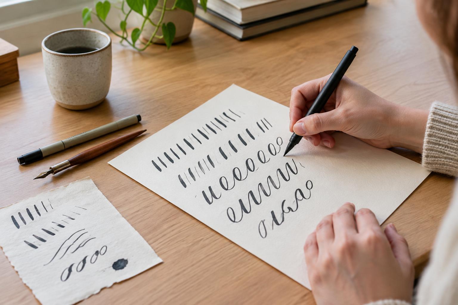
If you like the flowing look of brush calligraphy, try a small-tip brush pen. Its flexible tip makes a narrower mark with a light touch and a wider mark with more pressure. A smaller tip can be easier to control on compact letters; a larger tip suits bigger writing but may magnify shaky movements. Use smooth paper and a light hand, especially on the upward strokes. Rough paper can catch or wear a delicate tip.
Dip pens offer another path, particularly for pointed-pen or broad-edge styles, but they add decisions about nibs, ink and paper. They can be rewarding later; they are not required for learning letterforms. Whatever pen you choose, test it on a spare sheet first. Notice whether the ink feathers, bleeds through or dries slowly, and let that test guide your paper choice.
Build letters from repeatable strokes
Set up a page with a baseline for the letters to rest on and a second guideline for the height of lowercase letters. A third line above them can help with tall strokes. The exact measurements matter less than using the same guides throughout a practice page. Sit comfortably, leave room for your hand to move and turn the paper if an angled position feels more natural.
With a brush pen, begin by drawing rows of light upward strokes and heavier downward strokes. Then practice simple shapes: a straight downstroke, a curved entry stroke, an oval and a stroke that goes down before curving back up. Move slowly enough to see where pressure changes. If you use a monoline pen, draw the same shapes with even pressure and focus instead on smooth curves and consistent height.
Once the basic marks feel familiar, combine them into lowercase letters. Letters such as i, u, n and m share short strokes that rise and fall. Letters such as o, a, d and g rely on ovals. Practicing a small family of related letters is often more useful than copying the whole alphabet in order: you can spot which shared stroke needs attention.
Make a short practice session count
A manageable session might begin with a line of basic strokes, continue with two or three related letters, and end with a short word that uses them. Write the word several times rather than rushing to a new one. Compare the versions: Are the letters similar in height? Do the ovals close in a consistent place? Is there enough room between letters for the word to remain readable?
Aim for a steady rhythm rather than perfect copies. If a letter looks awkward, identify one part to change on the next attempt, such as the width of its oval or the angle of its entry stroke. Marking a version you like can be more encouraging than circling every mistake. Keep a few dated practice pages so you can see changes in your own work without comparing it to someone else’s finished piece.
Turn practice into something useful
When you are ready to make a card, gift tag or recipe heading, pencil in guidelines first and sketch where the words will sit. Try the phrase on scrap paper before using your final sheet. You may find that a short word needs more space than expected, especially if its letters have wide curves or long connecting strokes.
Write the final version at a pace that lets you control each letter, then give the ink time to dry before erasing any pencil marks. If a connection between two letters feels forced, lift the pen and start the next stroke separately. Legibility and a pleasing overall shape matter more than making every letter in a single motion. One pen, a few repeated strokes and a small finished project are enough to begin.