Start with a word, not an alphabet
Hand lettering is the process of drawing letters for a particular design. Unlike ordinary handwriting, it gives you permission to pause, reshape a curve and adjust a word until it looks balanced. You do not need a special pen or a polished style to begin. A pencil, an eraser, smooth paper and a ruler are enough to explore how letters fit together.
Choose a short word you like, such as “hello” or “garden.” Write it once in your usual handwriting, then draw it again more slowly. Notice its tall letters, rounded shapes and open spaces. Working with one word makes the task manageable: you can repeat the same letters, see what changes and decide which details you want to keep.
Build letters from repeatable strokes
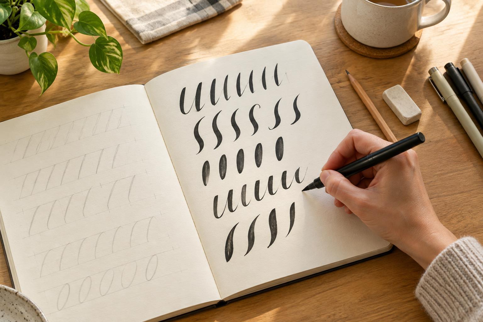
Before drawing a complete word, warm up with rows of simple marks: straight lines, gentle curves, circles and narrow oval shapes. Try making each row consistent rather than fast. If you are using a pencil or an ordinary pen, keep the pressure comfortable. You can add thicker areas later instead of trying to produce them in one movement.
A helpful first style uses light-looking upward strokes and heavier downward strokes. Draw a lowercase “n” slowly and identify where your hand moves up and where it moves down. Then add a second line beside each downward stroke and fill the gap. This technique, often called faux calligraphy, lets you explore contrast without a brush pen. Keep the thick parts on the same side of similar letters so the word feels deliberate.
Use faint guidelines for a baseline, the height of short lowercase letters and the height of taller letters. They are guides, not barriers: rounded letters may look better when they extend slightly beyond a line. If a stroke feels awkward, turn the page or draw the shape in two passes. The finished letter matters more than making every mark in a single motion.
Make spacing look even
Equal measurements do not always create equal-looking spaces. The gap between two straight-sided letters can appear wider than the gap beside a round letter, even when both measure the same. Begin by placing letters at roughly regular intervals, then step back and look at the empty shapes between them. Aim for a steady visual rhythm rather than identical distances.
Sketch your word lightly before darkening it. If one pair of letters feels crowded, move one letter or narrow a stroke. If a gap seems too open, bring the shapes closer or let a curve extend into the space. Check the space inside letters, too: small openings in “a,” “e” or “o” can disappear when you add thickness. Leaving those areas clear helps a decorative word remain readable.
For a phrase, settle the spacing within each word before arranging the words together. You can use a ruler to find the center of your page, but the visual center may shift if one side contains taller or heavier shapes. Make small adjustments while the sketch is still light.
Practice by changing one thing at a time
A useful practice page has a purpose. Draw the same short word three or four times, changing just one feature: letter width, slant, stroke thickness or spacing. Label the versions in the margin so you remember what you tried. When several features change at once, it is harder to tell why you prefer one result.
Afterward, circle a detail that works and mark one area to revisit. Your goal is not to judge the whole page as good or bad. Perhaps the curves feel smooth but the final letter sits too far away; that gives you a clear next exercise. On another page, repeat that letter pair until its spacing looks more natural. A few attentive minutes can be more useful than filling pages without looking back.
Keep early sketches rather than erasing every attempt. They provide a record of your choices and can supply ideas for another style. If your hand becomes tense, take a break and return with slower, lighter strokes.
Turn a sketch into a small finished piece
Once you like a word, try lettering it on a gift tag, recipe card or notebook cover. Plan its position in pencil first, leaving room around the edges. Darken the main strokes, add any extra thickness and erase the guidelines only when the ink is dry, if you used ink. A scrap-paper test can help you check whether a pen smears or bleeds on your chosen surface.
Keep decoration secondary to the letters. A simple underline or a few dots may be enough; too many flourishes can make a short word harder to read. Finishing a small piece gives your practice a purpose and shows which choices still work outside an exercise page. The next time you begin, you will have a clearer idea of the strokes and spacing you want to explore.